W Solutions
Constructing and EngineeringA fresh brand identity to assist an engineering startup providing acoustic and thermal insulation solutions in entering a new market in France.
Read more


Constructing and Engineering
What we did:Concept development
Brand identity and logo design
Visual identity application
Stationery production
W Solutions is an engineering startup specialised in providing thermal, acoustic and technical insulation systems for private and corporate clients. They were looking to enter the French market and needed a coherent and fresh-looking brand identity design to support their business development efforts.
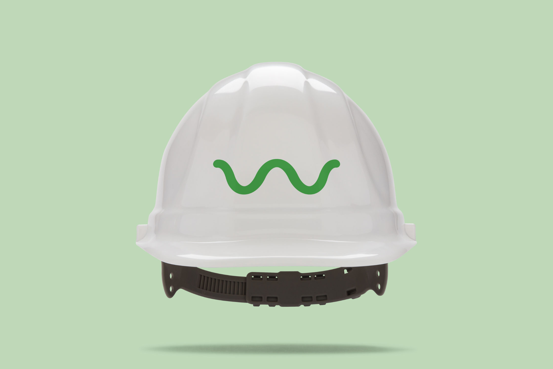
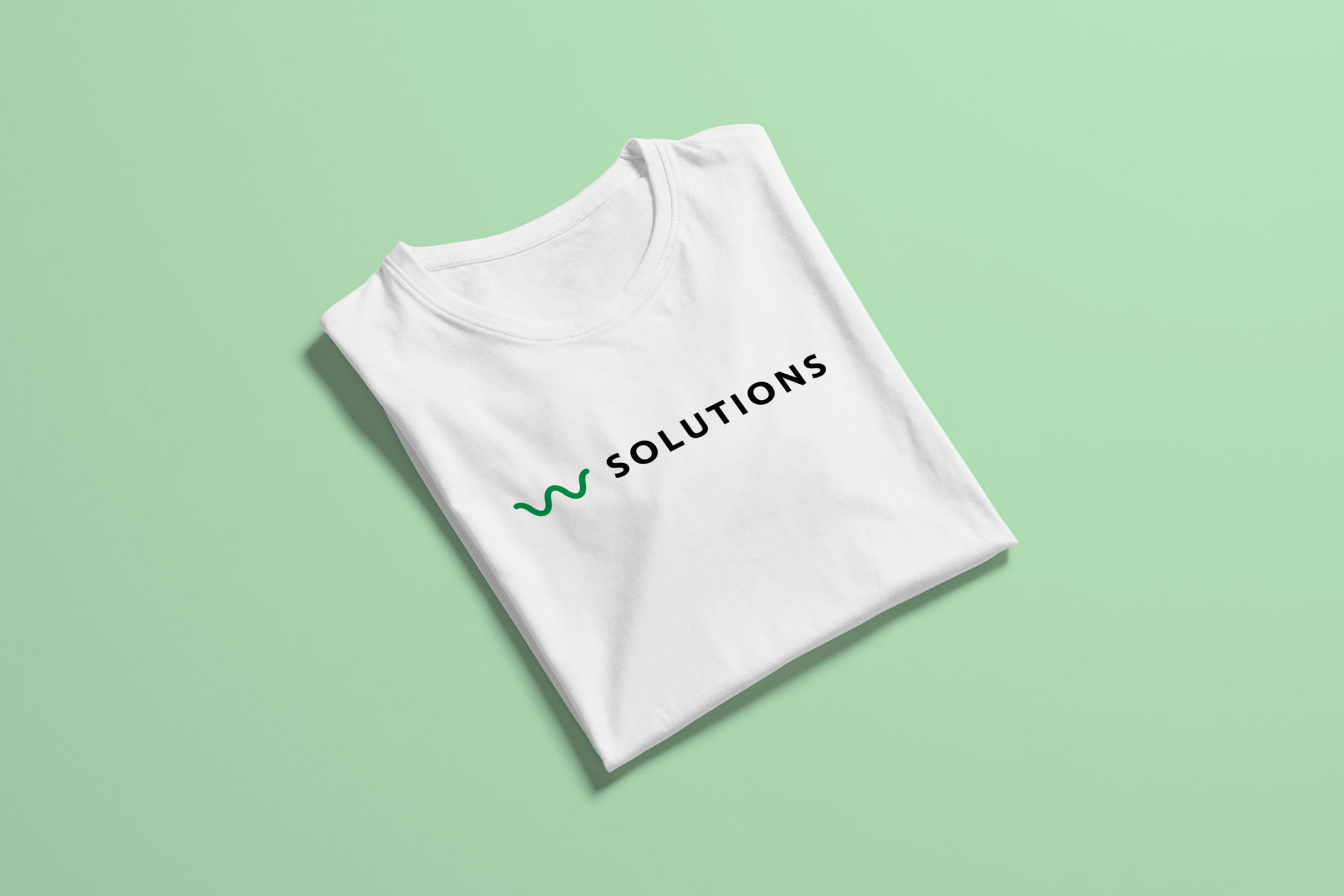
W Solutions is a young, innovative company that operates within a fairly non-visual industry. They required a strong and professionally-looking identity yet simple enough to allow it to be easily and cost-effectively applied across different outputs. We have decided to extrapolate the first letter of the company name as a base for the logotype. This letter was then altered into an undulating shape to create an iconic symbol, which depicts the letter W itself as much as an idea of a sound or thermal wave.
The new brand identity design was rolled out across the business in a relatively short time. We applied the new visuals across all touch points, starting with the design and production of new business stationery, documents and business cards. We have completed the launch with the design and rollout of new uniforms and vehicle branding.